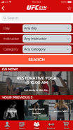
Redesigning the UFC Gym Mobile App
WHY?
I have been a member at the UFC Gym since 2014 and wanted to redesign the app to enhance a member's experience and support them in achieving their fitness goals.
GOAL
To redesign the UFC Gym application with clear navigation to help users explore new workouts or classes, achieve their goals and help promote merchandise to increase sales.
USER
All UFC Gym Members
RESEARCH
Survey, Interview, Card Sorting, User A/B Testing.
Result
An interactive prototype that is aligned with the user's needs with improved navigation and usability.
Note: I am in no way affiliated with UFC or UFC Gym.
ROLE:
UX Researcher | UX Designer | UI Designer | Product Manager
TEAM:
1 (Individual Personal Project)
BRAINSTORM:

HEURISTIC EVALUATION:
AUDIT:


Overall takeaways:
- Free to download model but a premium version is available to purchase (exporting, more workouts, personalized digital trainer)
- Follow along workouts are great for a home environment
- Recording workouts are important to show progress (incentives to keep going)
- Important factors about workouts (time commitment, equipment needed, muscle groups impacted, skill level)
- My Fitness Pal was the most polished, no major cons. Very focused on their goal.
- Easy to be overwhelmed with functions when creating an app that includes workouts, diets, tracking
RESEARCH:
Initial results
↓
Follow up questions

OLD USER FLOW:
Notes:
- Not very intuitive
- Lots of screens for simple functions
- Signing up for a class is not streamlined
- Lack of structure for information
NEW USER FLOW:
Notes:
- Information architecture: Recategorized into 5 categories: Me, News, Class, Explore, Store
- Removed extraneous features (details on bottom right )
- Fewer screens allow actions to be completed quicker
-
Persona A

Alex, 34
Behavior:
Goes 3-5 times a week. Regularly attends classes. Ultimate membership.
Pain points:
Uses the app almost every day but isn’t very friendly.
Needs:
Signs up for classes, Attending a class to stay healthy and have fun, Enjoys a community
Persona B

Brian, 26
Behavior:
Goes 3 - 5 times a week. Does not purchase from the store or sign up for classes. Regular fitness membership.
Pain points:
Wants to learn more but is stuck in the same routine, Wants a gym partner.
Needs:
Bodybuilding, Learning new workouts, Nutritional information.
INTERVIEW
“I never use the app outside of the check-in feature.”
“I don’t know about any current sales.”
“The rewards are tiny and not worth it. I’ve been going to the gym almost every day for 3 months and I still can’t get a free smoothie.”
“I’ve never participated in a challenge.”
“It’s hard to use and kind of useless.”
“The smoothies taste good but the menu is hard to read, the font is small and there are too many options. The supplements are bad and overpriced. I use Amazon to get my supplements.”
AFFINITY MAPPING:

I created blue notes for data and pink notes for corresponding ideas. Affinity mapping helped organize clusters of big ideas, and see what trends would pop up. Some big categories that would affect users were opportunities to learn, merchandise and sales, and classes.
For these reasons, I wanted to focus on allowing gym members to learn more through the app, increase sales, and to explore and sign up for classes hassle free.
INFORMATION ARCHITECTURE:
Using the results from the closed card sort, this was the resulting organization of categories. The 5 main categories were Me, News, Class, Explore, and Store. This helps create a more intuitive home page and allow for clear navigation in the redesign.
The most confusing one was Rewards as people put it in News, Explore, and Me. The second potentially ambiguous one was Find a Gym Partner as it was sorted into Class as well. These are two areas where I will be keeping a close eye on during user testing and appropriate changes will be made.
WIREFRAMES:
PROTOTYPE:
Color Palette:
#d20a0a - UFC Red
I used material io to help me create a color palette that would be easy to read and promoted the signature UFC red.

Screen exports:
WIP Interactive prototype link (Does not work for mobile):
In progress initial screens created in Figma.
USER TESTING:
Confusing
Users didn't understand the purpose of the app. Many felt lost and overwhelmed with so many functions.
Declutter
There were too many things to do, the landing page was too much. Needs to be more intuitive as many skip onboarding.
Class
This would be a good direction to build the app's main purpose. Streamline and make signing up for classes effortless.
Figma
Non-responsive and crashed a lot. Difficult to create a fully functional high-fidelity prototype within Figma. Awkward to test.
Takeaways:
- The purpose of the app should be crystal clear. Currently is too broad and needs to excel in one function before adding more.
- Add pricing to the store.
- The app needs to function intuitively without needing users to go through onboarding (some people opt to skip).
- A unique way of recording weights (barbell visual) but overall is the most confusing function of the app.
- Enjoyed the demonstration and variation for exercises
- Tags are a great way of quickly conveying information about workouts (keep consistent and link with instructors).
Technical:
- The limitations of Figma for testing the prototype (great for design, but many issues when prototyping).
- Slow at loading lots of images. Crashes often.
- Need a higher fidelity version to have a more natural test.
- Unable to run on mobile, resorted to desktop testing.
- Explore Marvel, InVision, Principle or Origami (Build one function out completely - Signing up for classes).


